Steps
Field steps, component steps, conditions, gates, and the wizard API a component reads.
Field steps
A field step renders the listed paths with Payload's own field rendering against the form state. A field that carries custom components gets them. Fields not listed on any step stay in form state with their values and are submitted with the document.
On a forward move, only the current step's paths are validated (server-side, nested paths included). Invalid fields show their errors and the move is refused. After the first refused move, an invalid field shows its error as soon as it appears on screen, on any step.
If the save itself returns an error for a field on no step, Payload shows it as a toast. Whether a variant covers every required field is not checked at config time.
Layout
A step lists fields in one column by default. Three containers give it a shape: row, collapsible and group. They nest freely and may hold component items too.
fields: [
  { type: 'row', fields: ['firstName', 'lastName'] },
  {
    type: 'row',
    fields: [
      { path: 'title', admin: { width: '70%' } },
      { path: 'status', admin: { width: '30%' } },
    ],
  },
  {
    type: 'group',
    label: 'Reaching them',
    fields: [{ type: 'row', fields: ['email', 'phone'] }, 'address.city'],
  },
  {
    type: 'collapsible',
    label: 'Rarely needed',
    initCollapsed: true,
    fields: ['notes'],
  },
]| Container | Properties |
|---|---|
row | fields |
collapsible | label (required), initCollapsed, fields |
group | label, description, fields |
These are the step's containers, not the collection's. They carry no name and contribute no path, and the collection's own containers are unaffected: a field keeps the path, condition, validation and custom components it has on the native form wherever a step puts it. So a step can put fields that sit in different tabs of the collection side by side in one row, and a field from the sidebar next to one from the main column.
A step does not inherit the collection's containers either. Listing firstName and lastName out of a collection row gives two stacked fields; put them in a step row to get the row back.
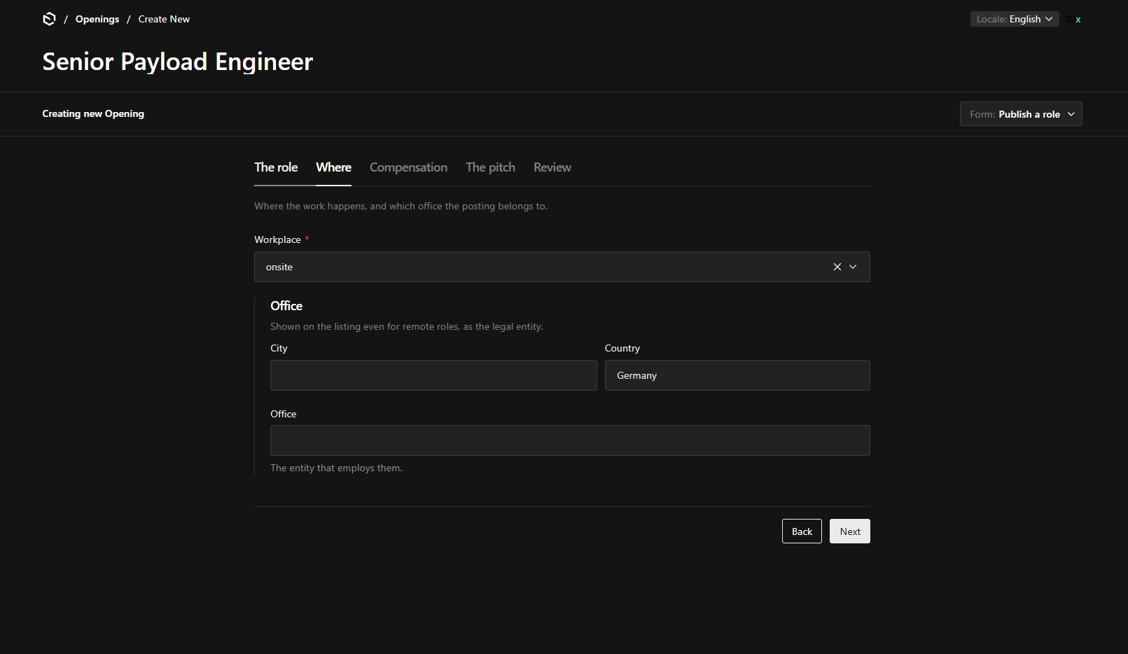
The group and the row in that screenshot are the step's own. In the collection, those three fields sit in a group called location with nothing around them.
Width
admin.width on a field item is Payload's own admin.width: any CSS length, and it sizes the field inside a row. Fields without one share what the sized ones leave. Widths in a row add up to the row, so 70% and 30% sit on one line; the gap between them is taken out of the widths rather than added to them, as on the native form. Below Payload's mid breakpoint a row stacks and widths are ignored.
Outside a row admin.width does nothing, as on the native form.
Not containers
tabs inside a step and admin.position: 'sidebar' are not supported. A step has one column.
Component steps
A component step is a Payload component rendered on the server with { collection, variant, step } as props. A server component is a static frame rendered once at page load; anything live inside it is a client child reading the hooks below. The same holds for slots.
'use client'

import { useWizard, useWizardState } from '@10x-media/form-variants/client'
import { useFormFields } from '@payloadcms/ui'

export const DuplicateCheckStep = () => {
  const { back, finish, save } = useWizard()
  const [checked, setChecked] = useWizardState<boolean>('duplicateCheckPassed')
  const lastName = useFormFields(([fields]) => fields.lastName?.value)
  // search, then either save() or finish({ title: 'Request sent' })
}
Driving the footer
A component step that needs a button of its own does not have to draw one. setPrimaryAction replaces the footer's primary button while the step is open, and setMessage writes the line beside it, so the step keeps the one Back button, the one primary button and the one status line every other step has.
const { setMessage, setPrimaryAction } = useWizard()

useEffect(() => {
  if (matches === null) {
    setPrimaryAction({ disabled: true, label: 'Searching…', onClick: () => {} })
    return
  }
  if (matches.length === 0) {
    setPrimaryAction(null) // back to the wizard's own Next or Save
    return
  }
  setMessage(`${matches.length} people already have that name.`)
  setPrimaryAction({ label: 'Ask an admin to create it', onClick: requestCreation })
}, [matches, requestCreation, setMessage, setPrimaryAction])
Both lapse on their own when the step changes, so there is nothing to clean up. setPrimaryAction(null) restores Next, or the save controls on the final step. Hiding the footer entirely with components: { Navigation: false } and drawing a second set of buttons is the other way, and it is the one that ends up with two of everything.
Conditions
A step's condition runs on the server with the current values and wizard state. It is evaluated at page render against the saved document, on every step change, and again after each edit the form settles on, so a step appears or disappears as soon as the field its condition reads changes rather than at the next move. On a new document the first render has empty values, so a condition that depends on them is false until the first edit.
The step the user is on is the one exception: it stays on screen even when its condition turns false under them, so that typing cannot move them off the step they are filling in. It goes away on the next move.
Re-evaluation is debounced and only fires when form state really changed, so it costs one request per settled edit. What that request reads depends on whether the document exists yet:
| Reads per call | |
|---|---|
| Create, no document yet | none |
| Existing document | 2 |
| Existing document, drafts enabled | 3 |
A guided variant creating a document reads nothing. A save: 'always' sections variant with conditions pays the reads above for as long as the document is being edited.
Gates
A gate runs on the server when the user leaves the step forwards, after the step's validation passed. It answers one of:
| Result | Effect |
|---|---|
{ result: 'continue' } | Move on |
{ result: 'block', message } | Stay, show the message |
{ result: 'patch', values?, state? } | Apply, then move on |
patch.values replaces the value at each given path without deep merging. Paths are not limited to the current step: setting a field that is on no step (a value derived from a lookup) is a reason to have a gate. An array or blocks field is replaced whole, which rebuilds the form state from the server. patch.state shallow-merges into wizard state.
Anything richer (show the matches, offer a request to admins) is a component step.
Wizard state
A JSON object scoped to the document page or drawer, shared by the steps and never saved to the document. It survives switching variants; a reload or a locale change clears it. Steps must work with it empty. It is sent to the evaluate endpoint with every call, so server logic sees it, and must not treat it as proof of anything: duplicateCheckPassed: true in wizard state guarantees nothing.
The hooks
From @10x-media/form-variants/client:
| Hook | Gives |
|---|---|
useWizard() | step, steps, index, count, isFirst, isLast, next(), back(), goTo(key), canGoTo(key), errorCount(key), save({ draft }?), finish(outcome), blockSave(reason) / allowSave(), saveAllowed, saveBlockedReason, saveBlockedMessage, onBeforeNext(fn), setPrimaryAction(action) / primaryAction, setMessage(text) / message, busy, error, readOnly, variant |
useWizardState<T>(key) | [value, setValue] over one key of wizard state |
useOutcome() | The data finish() or an outcome after-save action left behind |
useFormVariants() | active, available, switchTo(key), inDrawer, outcome, state / setState, collectionSlug |
Payload's useForm, useField, useFormFields, useDocumentInfo | The form and the document, unchanged |
finish(outcome) ends the wizard without a native save and shows the Outcome slot. onBeforeNext is the client-side counterpart of gate; returning false refuses the move.
Read-only documents
When the document is locked by another user or otherwise read-only, the runner is read-only too: Back and Next still move between steps so the document can be read, no validation runs, the evaluate endpoint is not called, and saving is disabled.