Settings Overlay
Files any Payload collection, global, admin view or component behind a deep-linkable floating panel.
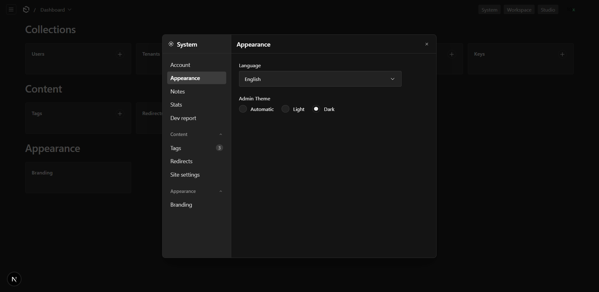
@10x-media/settings-overlay puts a collection, a global, a registered admin view or a component of your own behind a floating panel, and makes that panel addressable by URL. ?settings=system/tags/abc opens the panel on that document. Copy the link, send it, it reopens the same thing.
import { buildConfig } from 'payload'
import { settingsOverlay } from '@10x-media/settings-overlay'
import { appearanceItem } from '@10x-media/settings-overlay/items'

export default buildConfig({
  plugins: [
    settingsOverlay({
      overlays: [
        {
          id: 'system',
          label: 'Settings',
          items: [
            appearanceItem(),
            { type: 'collection', slug: 'tags' },
            { type: 'global', slug: 'branding' },
          ],
        },
      ],
    }),
  ],
})
Run payload generate:importmap and that is the installation. No change to app/(payload)/layout.tsx, no provider to mount by hand.
The idea
Some collections are not content. Redirects, tags, feature flags, branding: things an editor touches occasionally and never browses. Giving each one a nav row and a route of its own spends the most valuable space in the admin on the least used part of it.
This plugin files them behind one panel instead, addressable by a URL you can send to somebody. Turn hideEntities on and the panel becomes the only way in; leave it off, and it sits beside the collection's own route.
What can go in a panel
| Type | Source | Own URL | When it is fetched |
|---|---|---|---|
collection | slug | yes, unless hideEntities is on | on open |
global | slug | yes, unless hideEntities is on | on open |
component | component | no | with the page, or on open with lazy: true |
view | viewKey in admin.components.views | yes | on open |
link | href | n/a | n/a |
Collections and globals render through Payload's own list and edit views, so filtering, sorting, drafts, uploads, relationship drawers and field customisation all behave as they do on a page. They render in drawer mode, which leaves a few page-only features out; see what drawer mode leaves out.
A component may be a server or a client component. The plugin renders it the way Payload renders any custom component and hands server props only to the former.
What it does not do
- It is not a sidebar. The plugin ships no nav button, and depends on no navigation plugin. It gives you
useSettingsOverlay()and you place the button where it belongs in your admin. - It is not a settings system. The panel is a container and a rail. What goes in it is Payload's own views or your components.
- It is not a form renderer. Nothing here re-implements a Payload field.
Where to go next
- Quick start: install, open the panel, deep-link into it.
- Items: the five types and what each one is for.
- Access: who sees which row, and why none of it reaches the browser.
- Customization: slots, hooks and the props each replacement gets.
- Embedded views: putting a registered admin view in the panel, and the one case that needs a bundler alias.
- Configuration: every option, in one place.
- i18n: the bundled locales and how to override a string.