Customization
Slots, hooks, and the CSS contract.
The panel has seven replaceable pieces. Each comes with a typed props contract and the hooks that give a replacement the state it can no longer compute for itself.
settingsOverlay({
  overlays: [
    {
      id: 'system',
      label: 'Settings',
      components: {
        RailItem: './rail/Row#Row',
        Header: './panel/Header#Header',
      },
      items: [...],
    },
  ],
})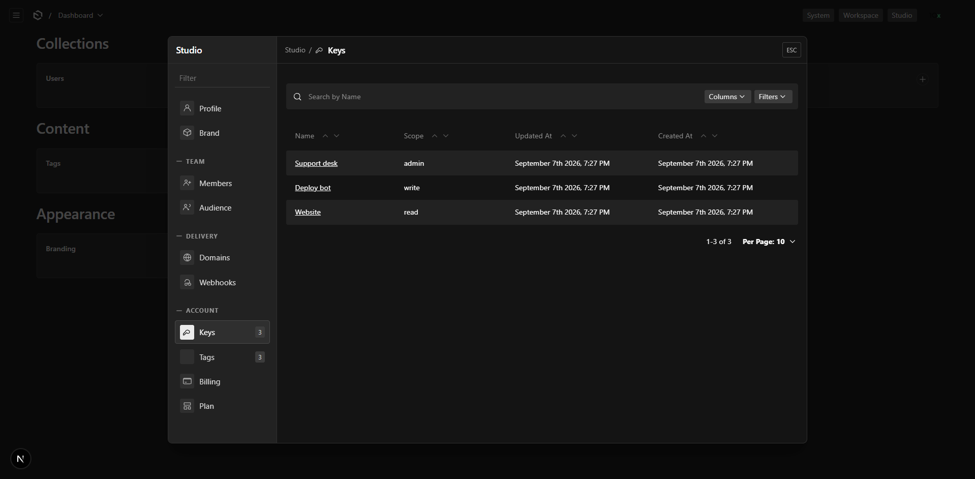
Slot components are rendered by the plugin's server provider, so a replacement may be a server or a client component. Only serializable props cross that boundary; everything dynamic arrives through the hooks below.
| Slot | Replaces | Extra props |
|---|---|---|
Panel | the whole panel body | overlayId, layout |
Rail | the left rail | overlayId, layout |
RailGroup | one group heading and its rows | group: { label } |
RailItem | one row | item: ManifestItem |
Header | title, back, create, close | overlayId, layout |
Search | the rail's search box | overlayId, layout |
Empty | the "nothing here" state | overlayId, layout |
Setting a slot to undefined keeps the default.
Panel and Rail swallow the slots beneath them. Panel replaces the entire panel body, so
Rail, RailGroup, RailItem, Header, Search and Empty are never reached; Rail replaces
the rail, so RailGroup, RailItem and Search are never reached. Reach for either only when
you intend to draw that whole region yourself. The five composable slots
(RailGroup, RailItem, Header, Search, Empty) combine freely.
Replacing Header also means taking over what the default one draws: the back button and the
Create button under mergeListHeader.
useSettingsPanel() gives you canGoBack, goBack and requestClose; the rest is yours to
include or leave out. Document actions are not in the header, so a replacement does not lose
them: they render inside the edit view itself. On phone-width screens the default header's close
button moves up to the panel's top corner, clear of the stacked rail; a replacement places its own.
Hooks
| Hook | Available in | Gives |
|---|---|---|
useSettingsOverlay() | anywhere in the admin | open, close, toggle, navigate, target, setTarget, isOpen, manifests |
useSettingsPanel() | inside a panel | activeItem, manifest, visibleGroups, overlay, search, setSearch, filtering, goBack, canGoBack, requestClose |
useSettingsItemState(slug) | inside a rail | item, icon, isActive, select |
useSettingsBadge(slug) | anywhere | the badge value for one row |
useSettingsOverlayEmbed() | inside a pane | where the caller is, or null |
All of them come from @10x-media/settings-overlay/client.
Replacing a row
'use client'
import { useSettingsItemState, useSettingsBadge } from '@10x-media/settings-overlay/client'
import type { ManifestItem } from '@10x-media/settings-overlay/types'

export const Row = ({ item }: { item: ManifestItem }) => {
  const state = useSettingsItemState(item.slug)
  const badge = useSettingsBadge(item.slug)
  if (!state) return null

  return (
    <button onClick={state.select} aria-current={state.isActive ? 'page' : undefined}>
      <MyIcon name={item.slug} />
      {item.label}
      {badge !== undefined && <span>{badge}</span>}
    </button>
  )
}
This is how a project's own pictogram set gets into the rail without the plugin knowing anything about it.
Replacing a group
A group needs its rows, and the plugin will not hand a server-rendered component a list of client children. Render them with the exported component instead:
'use client'
import { SettingsRailItems } from '@10x-media/settings-overlay/client'

export const Group = ({ group }: { group: { label: null | string } }) => (
  <section>
    {group.label && <h4>{group.label}</h4>}
    <SettingsRailItems group={group.label} />
  </section>
)
SettingsRailItems renders the default rows, or your RailItem replacement if you set one, so the two customisations compose.
Use it rather than looping over manifest.groups yourself: it reads visibleGroups, the list
already narrowed by the search box, so a custom group stays filtered. manifest.groups is the
unfiltered set, for when you want that instead.
Knowing you are in a panel
Anything rendered inside the pane can ask where it is:
'use client'
import { useSettingsOverlayEmbed } from '@10x-media/settings-overlay/client'

export const MyField = () => {
  const embed = useSettingsOverlayEmbed()
  if (!embed) return <FullPageVersion />
  return <CompactVersion onDone={embed.close} />
}
It returns null outside a panel, and { overlayId, itemSlug, itemType, layout, docID?, directDocID?, close, setTarget } inside one. directDocID is set when resolveDocID pointed the row straight at one document. It answers for the pane, not for the admin: a component elsewhere on the page gets null even while a panel is open.
A server component gets the same object minus the two functions, as a settingsOverlayEmbed prop:
import type { SettingsOverlayItemServerProps } from '@10x-media/settings-overlay/types'

export const Usage = async ({ req, settingsOverlayEmbed }: SettingsOverlayItemServerProps) => {
  const count = await req.payload.count({ collection: 'imports' })
  return <p>{count.totalDocs} imports in {settingsOverlayEmbed.overlayId}</p>
}
CSS
The panel's look is set through custom properties declared under :where(), so overriding any of them needs no specificity fight:
.settings-overlay {
  /* Frame */
  --settings-overlay-width: min(54rem, 100%);
  --settings-overlay-height: min(44rem, 100%);
  --settings-overlay-rail-width: minmax(170px, 13.5rem);
  --settings-overlay-header-height: calc(var(--base) * 2.4);
  --settings-overlay-radius: var(--style-radius-l);
  --settings-overlay-shadow: 0 1.5rem 3rem rgb(0 0 0 / 0.25);
  --settings-overlay-transition: 150ms linear;

  /* Colour */
  --settings-overlay-surface: var(--theme-elevation-0);
  --settings-overlay-rail-surface: var(--theme-elevation-50);
  --settings-overlay-border: var(--theme-elevation-100);
  --settings-overlay-text: var(--theme-text);
  --settings-overlay-muted: var(--theme-elevation-500);
  --settings-overlay-group-color: var(--theme-elevation-400);
  --settings-overlay-item-color: var(--theme-elevation-750);
  --settings-overlay-hover-bg: var(--theme-elevation-100);
  --settings-overlay-active-bg: var(--theme-elevation-150);
  --settings-overlay-backdrop: var(--theme-overlay);

  /* Space Payload's own views get inside the pane */
  --settings-overlay-pane-gutter: calc(var(--base) * 0.8);
}
Every default is a Payload theme variable, so the panel follows the admin's light and dark themes with nothing to maintain, and every metric is a multiple of --base rather than a rem: the admin's 1rem is 13px, so a panel sized in rem drifts out of step with the fields inside it. Scope overrides to one panel with className on the overlay, or with .settings-overlay--<id>.
Two layout presets ship: compact (the default) and wide.
What the plugin hides in a hosted view
Payload's list and edit views, rendered in drawer mode, draw their own close button for the drawer slug, which here is the panel itself. The pane header already has one, so the plugin hides theirs:
.settings-overlay__pane-body .list-drawer__header-close,
.settings-overlay__pane-body .doc-drawer__header-close {
  display: none;
}
It also:
- narrows the gutter. Payload's page gutter is
base(3), sized for a full window. The pane redefines--gutter-hitself, so the matching negative gutters stay in step with it. Set--settings-overlay-pane-gutterto change the value. - folds the list's title row into the pane header, when the overlay's
mergeListHeaderis on (the default). Only.list-header__contentis hidden; the collection's description and anything else in__after-header-contentstays. The Create button is re-rendered in the pane header with Payload's ownPill, itslist-header__create-new-buttonclass and itsgeneral:createNewlabel, so styling and translation follow the original. SetmergeListHeader: falsefor Payload's header exactly as a page renders it. - drops the drawer list header's top margin, which Payload sizes to clear a real drawer's close button. The pane header already occupies that band.
- pulls the edit view's sticky controls bar to the top of the pane, where the panel has no app header for it to clear.
These are unlayered rules while Payload's live in @layer payload-default, so none of them needs !important and your own unlayered stylesheet can undo any of them the same way.