Rich text
The instance editor that validates message bodies, the composer that writes them, and how a project adds its own formatting to both.
A message body is Lexical JSON. Three pieces touch it, and a project feature has to reach all three:
| Piece | Where | Job |
|---|---|---|
| Instance editor | server, editor option | Validates every body, derives text and mentions |
| Composer | browser, ChatComposer or the registry composer | Writes the body: toolbar, / menu, @ mentions, markdown shortcuts |
| Converters | browser, MessageBody | Turn a stored body into JSX |
The instance editor
Each instance builds its own lexicalEditor for the body field of <slug>-messages. It never inherits the project's editor. The defaults are the formatting a short message needs:
- paragraph, bold, italic
- link, external only (no internal links to documents)
- bulleted and numbered lists
- mention (the plugin's own inline node, carrying a user key)
On every save the server:
- validates the body against these features, so a node the editor does not know is rejected;
- refuses links whose scheme is not
http,httpsormailto; - derives
text, a plain-text projection where a mention reads@Name, and enforceslimits.bodyLengthon it; - caps the serialized body at
limits.bodyBytes(64 KiB by default); - derives
mentionsfrom the mention nodes, keeping at mostmentions.maxand only users who can read the channel (see Access).
The editor option reshapes the features:
import { UnderlineFeature, StrikethroughFeature } from '@payloadcms/richtext-lexical'

conversations({
  slug: 'comments',
  // ...
  editor: ({ defaultFeatures }) => [...defaultFeatures, UnderlineFeature(), StrikethroughFeature()],
})
Keep defaultFeatures in the list. Dropping them drops the mention feature too, and mentions stop working.
A website that has no editor can send { text } instead of a body. The server wraps it into a one-paragraph body. See Messages.
The composer
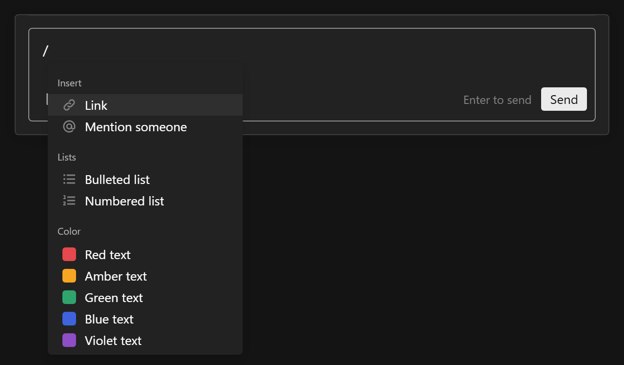
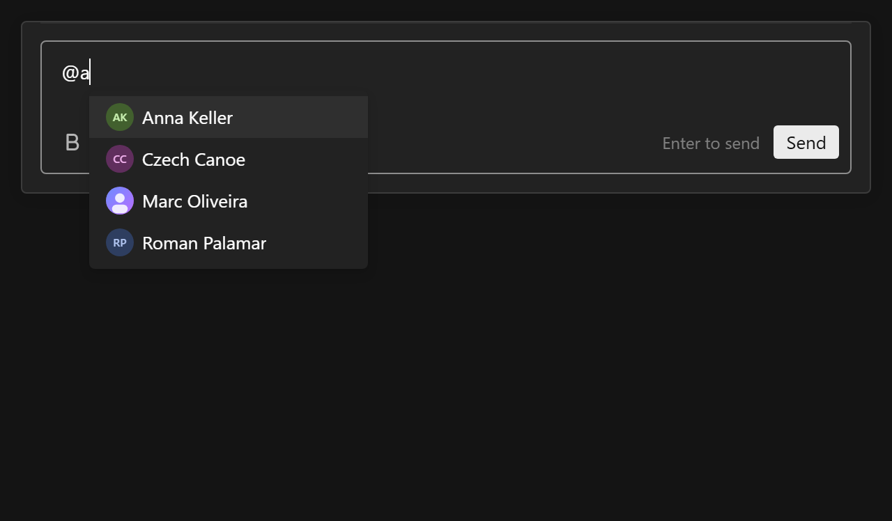
The composer is the plugin's own Lexical editor, not Payload's rich text field. It is built on the Lexical that @payloadcms/richtext-lexical re-exports, so a project never ships two copies, and its core (@10x-media/conversations/composer) imports nothing from @payloadcms/ui, so the same editor runs on a website.
What it does out of the box:
- Enter sends, Shift+Enter breaks the line, Enter inside a list adds an item.
submitOn: 'mod+enter'makes only Ctrl/Cmd+Enter send. /opens the commands of every feature.@searches people who can read the channel.- Markdown shortcuts:
**bold**,*italic*,-and1.for lists,[text](url). - Links: Ctrl/Cmd+K, the toolbar or
/linkopen a small field at the selection. Pasting a URL over selected text links it, and typed URLs link themselves.
Toolbar placement
toolbar on ChatComposer (and on the registry composer) places the formatting buttons:
<ChatComposer toolbar="bottom" /> // default
<ChatComposer toolbar="top" />
<ChatComposer toolbar="none" />   // `/` and markdown still work
<ChatComposer toolbar={{ placement: 'bottom', items: ['bold', 'italic', 'insert'] }} />
items keeps and orders group or item keys: a group key (format, insert, lists) keeps the whole group, an item key (bold, link) keeps that one button. Buttons that do not fit the row move into a "⋯" menu at its end, so the send button never moves.
Built-in features
All exported from @10x-media/conversations/composer (and re-exported from /client):
| Feature | Adds | Toolbar group |
|---|---|---|
boldFeature() | bold, Ctrl/Cmd+B, ** | format |
italicFeature() | italic, Ctrl/Cmd+I, * | format |
linkFeature() | link nodes, the link field, autolink, /link | insert |
listsFeature({ toolbar? }) | bulleted and numbered lists, / commands, markdown | lists, only with toolbar: true |
mentionFeature() | the mention node, @ search, /mention | insert |
defaultComposerFeatures() returns all five, matching the default instance editor.
Writing a composer feature
A feature is shaped like a Payload editor feature: toolbar groups and / menu groups, merged across features by key and sorted by order, so a feature can add a button to the built-in format or insert group.
type ComposerFeature = {
  key: string
  nodes?: Array<Klass<LexicalNode>> // Lexical nodes the editor registers
  markdown?: Transformer[]          // markdown shortcuts
  Plugin?: ComponentType            // rendered inside the editor, for listeners and commands
  toolbar?: { groups: ComposerToolbarGroup[] }
  slashMenu?: { groups: ComposerSlashGroup[] }
}
defineComposerFeature types a feature in place and returns it unchanged.
Toolbar groups are type: 'buttons' (items side by side) or type: 'dropdown' (items behind one button, with an optional ChildComponent icon and label). Each item has:
| Field | |
|---|---|
key | Used by toolbar.items and for merging |
label | A string, or ({ labels, t }) => string; in the admin t is Payload's translation function |
ChildComponent | The icon of the default button, and of the dropdown row |
Component | Replaces the default button entirely; gets { editor, active, enabled, close, item } |
isActive, isEnabled | ({ editor, selection }) => boolean, run inside editorState.read() |
onSelect | ({ editor, isActive }) => void |
order | Position within the group |
Slash menu groups have a key, an optional label (the section title), and items with key, label, Icon, keywords (extra words the query matches) and onSelect({ editor, queryString }). The menu ranks by prefix: a label start, a word start, the key, or a keyword.
OPEN_LINK_EDITOR_COMMAND opens the link field at the selection. Ctrl/Cmd+K and the link button dispatch it, and your own feature can too:
import { OPEN_LINK_EDITOR_COMMAND } from '@10x-media/conversations/composer'

editor.dispatchCommand(OPEN_LINK_EDITOR_COMMAND, undefined)
features on ChatComposer replaces the default feature list for that one composer:
<ChatComposer features={({ defaultFeatures }) => [...defaultFeatures, myFeature()]} />Features that live in Payload's own editor UI, such as blocks, upload or relationship drawers, are not available in the composer.
Links between the two shapes
The composer uses @lexical/link nodes (url, target, rel); Payload's link feature stores fields: { url, newTab, linkType }. The composer maps between them when it loads and when it sends, so the server, MessageBody and stored messages only ever see Payload's shape. If you drive a Composer yourself, use the same two functions:
import { toEditorJSON, toStoredJSON } from '@10x-media/conversations/composer'

const initial = toEditorJSON(message.body)          // stored body into the editor
const body = toStoredJSON(editor.getEditorState().toJSON()) // editor state to send
Rich text pairs
A project's formatting has two halves that travel together: the composer feature that writes it, and the converters that show it. If only the first half is installed, a message looks right while it is typed and plain once it is sent.
Pass both through one provider:
- Admin:
ChatRichTextProviderfrom/client, around anyChatComposerand message below it. - Website:
ConversationUIProviderfrom the registry (see shadcn registry), which takes the same two props.
<ChatRichTextProvider composerFeatures={withTextColor} converters={textColorConverters}>
  <ChatPanel conversationKey={key} instance="tickets" threadSlug="ticket-thread" />
</ChatRichTextProvider>
composerFeatures is ({ defaultFeatures }) => ComposerFeature[] and applies to every composer below that does not pass its own features. converters are Payload's JSXConverters, merged over the defaults for every MessageBody below.
If the feature adds a node, the server needs to know it as well: add the matching Payload feature through the editor option, or bodies that contain the node are rejected. A feature that only sets attributes Payload's text node already carries (format bits, style) needs nothing on the server.
Walkthrough: text colour
The dev app ships a complete pair in packages/conversations/dev/features/textColor.tsx: a palette in the toolbar, one / command per colour, and a converter that shows the colour. It stores the colour in the text node's style, which Payload already carries, so the server editor stays as it is.
1. A palette and a way to apply it. Lexical's selection helpers set a color style on the selected text:
'use client'
import { defineComposerFeature, type ComposerFeature, type ComposerToolbarItemProps } from '@10x-media/conversations/composer'
import { $getSelection, $isRangeSelection, type LexicalEditor } from '@payloadcms/richtext-lexical/lexical'
import { $getSelectionStyleValueForProperty, $patchStyleText } from '@payloadcms/richtext-lexical/lexical/selection'

const COLORS = [
  { key: 'red', label: 'Red', value: '#e5484d' },
  { key: 'green', label: 'Green', value: '#30a46c' },
  { key: 'blue', label: 'Blue', value: '#3e63dd' },
]

const setColor = (editor: LexicalEditor, color: null | string) => {
  editor.update(() => {
    const selection = $getSelection()
    if ($isRangeSelection(selection)) $patchStyleText(selection, { color })
  })
  editor.focus()
}
2. A toolbar dropdown with its own UI. The item's Component replaces the default button, so the dropdown shows a row of swatches. close shuts the dropdown; onMouseDown with preventDefault keeps the editor's selection while clicking:
const Palette = ({ close, editor }: ComposerToolbarItemProps) => (
  <div style={{ display: 'flex', gap: 6, padding: '6px 8px' }}>
    {COLORS.map((color) => (
      <button
        key={color.key}
        aria-label={color.label}
        onMouseDown={(event) => event.preventDefault()}
        onClick={() => {
          setColor(editor, color.value)
          close()
        }}
        type="button"
      >
        <Swatch color={color.value} />
      </button>
    ))}
  </div>
)
3. The feature. One dropdown group in the toolbar, placed by order between the built-in groups, and a Color section in the / menu:
export const textColorFeature = () =>
  defineComposerFeature({
    key: 'textColor',
    toolbar: {
      groups: [
        {
          type: 'dropdown',
          key: 'color',
          label: 'Text color',
          order: 15,
          ChildComponent: PaletteIcon,
          items: [
            {
              key: 'palette',
              label: 'Text color',
              Component: Palette,
              isActive: ({ selection }) =>
                $isRangeSelection(selection) &&
                $getSelectionStyleValueForProperty(selection, 'color', '') !== '',
            },
          ],
        },
      ],
    },
    slashMenu: {
      groups: [
        {
          key: 'color',
          label: 'Color',
          items: COLORS.map((color) => ({
            key: `color-${color.key}`,
            label: `${color.label} text`,
            keywords: ['color', 'colour', color.key],
            Icon: () => <Swatch color={color.value} />,
            onSelect: ({ editor }) => setColor(editor, color.value),
          })),
        },
      ],
    },
  })

export const withTextColor = ({ defaultFeatures }: { defaultFeatures: ComposerFeature[] }) => [
  ...defaultFeatures,
  textColorFeature(),
]
4. The converter. Payload's TextJSXConverter still draws bold, italic and the rest; the override wraps its output in a coloured span. The stored style is user input (anyone can post a body by hand), so only palette colours pass:
import { type JSXConverters, TextJSXConverter } from '@payloadcms/richtext-lexical/react'

const colorOf = (style: unknown): null | string => {
  const match = typeof style === 'string' ? /(?:^|;)\s*color:\s*([^;]+)/.exec(style) : null
  const value = match?.[1]?.trim().toLowerCase()
  return COLORS.some((color) => color.value === value) ? (value ?? null) : null
}

export const textColorConverters: JSXConverters = {
  text: (args) => {
    const base = TextJSXConverter.text
    const rendered = typeof base === 'function' ? base(args as never) : base
    const color = colorOf((args.node as { style?: unknown }).style)
    return color ? <span style={{ color }}>{rendered}</span> : rendered
  },
}
5. Use the pair. The dev app uses the same file in two places: the ticket field in the admin (dev/components/TicketConversation.tsx, through ChatRichTextProvider) and the customer's /support page (through ConversationUIProvider):
<ConversationUIProvider composerFeatures={withTextColor} converters={textColorConverters} slots={reactionSlots}>
  <ConversationPanel conversationKey={collectionKey('tickets', ticketId)} />
</ConversationUIProvider>
The file is marked 'use client': features hold components and editor callbacks, so they are passed from client components, not from payload.config.ts.