shadcn registry
Ready conversation components in shadcn's look, copied into your project and built on the headless hooks.
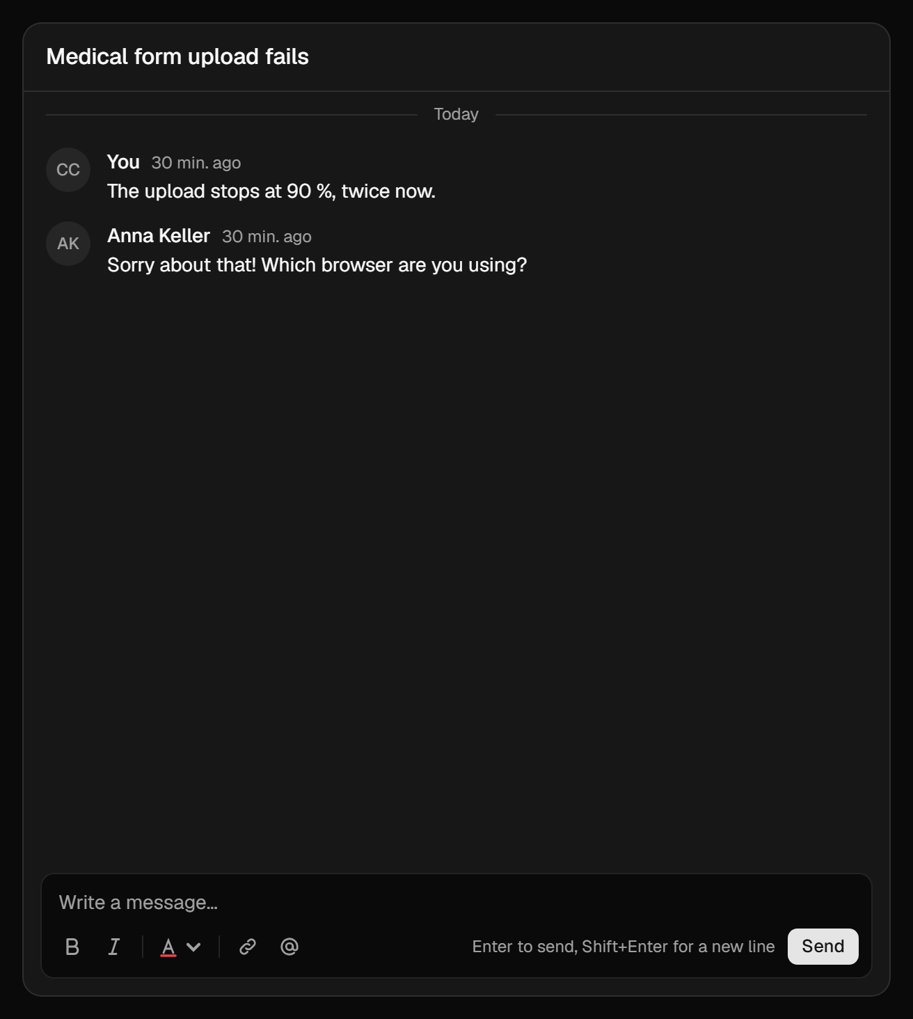
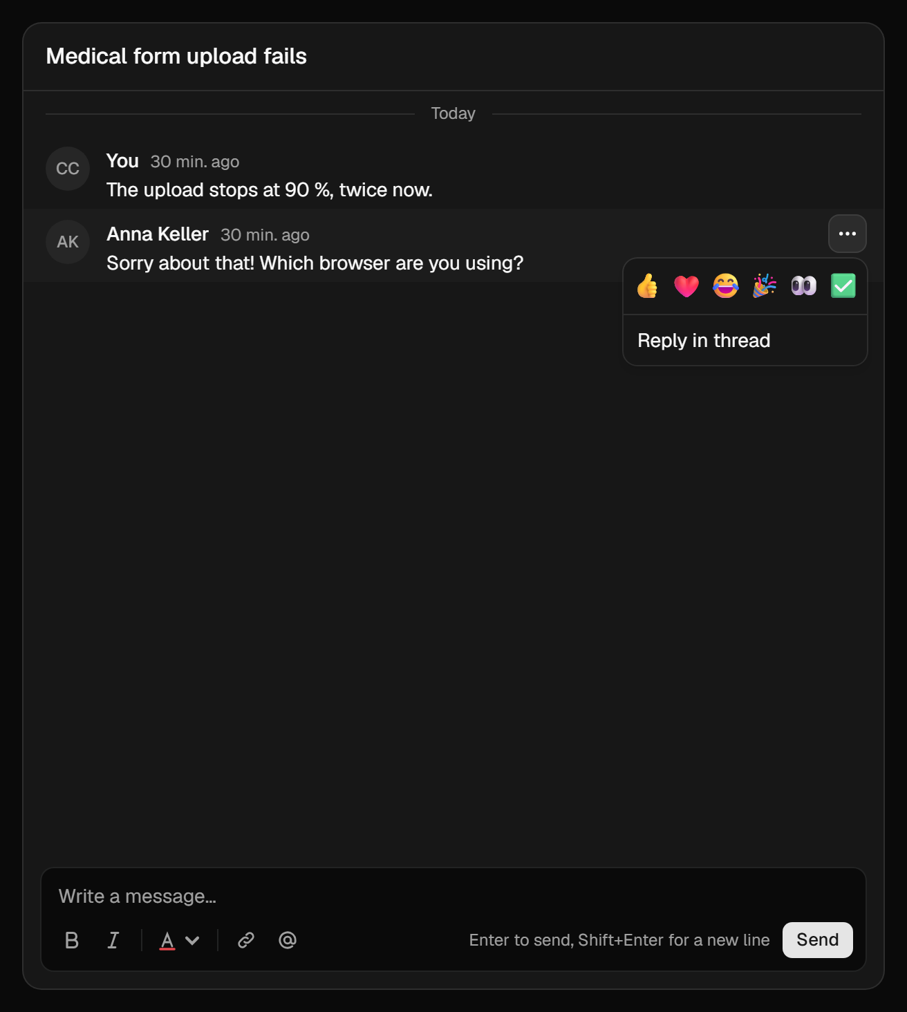
For projects on shadcn, the registry installs a complete conversation UI into your codebase: channel tabs, a scrolling feed, messages with a menu, the composer, threads, and reactions. Every component draws state that comes from the package's headless hooks, so the behaviour (paging, the "New messages" divider, optimistic sends, drafts, retry, realtime) stays in the package and updates with it. The markup and classes are yours.
Install
The registry is served from this site. Add the whole panel by its URL:
npx shadcn@latest add https://docs.10xmedia.de/r/conversations/conversation-panel.jsonconversation-panel pulls in the items it is built from. Add an extension's item separately when the instance has the reactions or attachments extension:
npx shadcn@latest add https://docs.10xmedia.de/r/conversations/conversation-reactions.json
npx shadcn@latest add https://docs.10xmedia.de/r/conversations/conversation-attachments.json
Files land in components/conversations/. Or register the namespace once in components.json and add items by name:
{
  "registries": {
    "@10x-conversations": "https://docs.10xmedia.de/r/conversations/{name}.json"
  }
}
npx shadcn@latest add @10x-conversations/conversation-panel @10x-conversations/conversation-reactionsEvery plugin with components is a registry of its own under /r/<plugin>/, with an index at /r/conversations/registry.json. The registry follows the repository's main branch, like these docs, so it can be a step ahead of the latest published package.
The components are written for shadcn's base-nova style (Base UI primitives, lucide icons) and Tailwind v4. They also need @10x-media/conversations and @payloadcms/richtext-lexical, which renders message bodies and carries the composer's Lexical.
The items
| Item | What it is | Uses |
|---|---|---|
conversation-ui | ConversationUIProvider: labels, locale, extension slots, custom message types, rich text features | |
conversation-panel | One conversation, complete: header, channel tabs, feed, composer; a thread opens in place with a back button | button |
conversation-channel-tabs | The readable channels as tabs with unread counts; nothing with one channel | |
conversation-feed | The scrolling window: "Load earlier", day separators, grouping, the divider, the "N new" pill | button |
conversation-message | Avatar, name, time, body, edited mark, thread summary, deleted placeholder, inline edit, a menu with reply, edit and delete | button, dropdown-menu, alert-dialog |
conversation-composer | The Lexical composer skinned with Tailwind: toolbar, / and @ menus, link field, channel cue, Send | button |
conversation-thread | A root message, its replies as their own feed, a reply composer | |
conversation-reactions | ReactionsBar, ReactionQuickActions and reactionSlots | popover |
conversation-attachments | AttachButton, AttachmentsPicker (picked files in the composer), MessageAttachments with an image and PDF viewer, and attachmentSlots | button, dialog |
The shadcn primitives (button, dropdown-menu, alert-dialog, popover, dialog) come from your own @/components/ui, and cn from @/lib/utils, as in any shadcn project.
A page
A ticket's conversation for the customer who owns it. The server component checks the ticket and hands down the instance's transport; the client component sets up the provider and draws the panel.
import { getInstance } from '@10x-media/conversations'
import config from '@payload-config'
import { headers } from 'next/headers'
import { notFound, redirect } from 'next/navigation'
import { getPayload } from 'payload'

import { SupportChat } from './support-chat'

export const dynamic = 'force-dynamic'

export default async function TicketPage({ params }: { params: Promise<{ id: string }> }) {
  const { id } = await params
  const payload = await getPayload({ config })
  const { user } = await payload.auth({ headers: await headers() })
  if (user?.collection !== 'customers') redirect('/support/login')
  const ticket = await payload.findByID({ collection: 'tickets', id, depth: 0, disableErrors: true })
  if (!ticket || String(ticket.customer) !== String(user.id)) notFound()
  return (
    <main className="mx-auto max-w-2xl p-6">
      <SupportChat
        subject={ticket.subject}
        ticketId={String(ticket.id)}
        transport={getInstance({ payload }, 'tickets').transport?.client}
      />
    </main>
  )
}'use client'
import {
ChatProvider,
type ClientTransportSpec,
collectionKey,
transportFromSpec,
} from '@10x-media/conversations/react'
import { useState } from 'react'
import { ConversationPanel } from '@/components/conversations/conversation-panel'
import { ConversationUIProvider } from '@/components/conversations/conversation-ui'
import { reactionSlots } from '@/components/conversations/conversation-reactions'
export function SupportChat({
subject,
ticketId,
transport,
}: {
subject: string
ticketId: string
transport?: ClientTransportSpec
}) {
const [client] = useState(() => transportFromSpec(transport))
return (
<ChatProvider instance="tickets" transport={client}>
<ConversationUIProvider slots={reactionSlots}>
<ConversationPanel
className="h-[70vh]"
conversationKey={collectionKey('tickets', ticketId)}
header={<h2 className="font-medium">{subject}</h2>}
/>
</ConversationUIProvider>
</ChatProvider>
)
}The page's own access check is for the page. The conversation endpoints check again on every request with the instance's access, so a customer who guesses another ticket's id gets nothing from them either.
ConversationPanel fills the height you give it and scrolls its feed inside. ChatProvider and the auth it relies on are covered on Website UI.
ConversationUIProvider
Optional. Without it the components use English labels and no slots.
| Prop | |
|---|---|
labels | Any of the strings the components show (defaultLabels in conversation-ui.tsx), for your language. replies, switchTo and unseen are functions |
locale | Picks channel labels and cues from localized config labels, and formats dates. Default en. Nothing reads the browser's language: pass your router's locale |
slots | Extension components as React components (a website has no import map): composerAbove, composerBelow, composerActions, messageActions, messageQuickActions, messageFooter, each a list |
renderType | (message, authors) => ReactNode: draws messages whose type is not text; return null for types you do not know. A layout: 'bare' type's result is the whole row |
composerFeatures | ({ defaultFeatures }) => features for every composer below |
converters | JSX converters for message bodies, to show what those features store |
composerFeatures and converters travel as a pair: a feature that stores something needs a converter that shows it. How to write both is on Rich text.
<ConversationUIProvider
  locale="de"
  labels={{ send: 'Senden', composerPlaceholder: 'Nachricht schreiben…' }}
  slots={reactionSlots}
  renderType={(message) =>
    message.type === 'ticket.status' ? <StatusRow data={message.data} /> : null
  }
>
Slots from several extensions merge by spreading, for example { ...reactionSlots, messageActions: [PinAction] }. Where two fill the same slot, join the lists: messageFooter: [...attachmentSlots.messageFooter, ...reactionSlots.messageFooter]. What each slot receives is typed in ConversationSlots.
Changing things
The copied files are a baseline to edit, not an API.
- Styling. Everything is Tailwind classes on shadcn's tokens (
bg-muted,text-muted-foreground,bg-popover,ring-foreground/10,bg-primary/10), so your theme applies as is. The composer is skinned throughcomposerClassNamesat the top ofconversation-composer.tsx, one class string per named part; the parts are listed on Headless. - Replacing the message. Edit
conversation-message.tsx, or write your own and import it inconversation-feed.tsxandconversation-thread.tsx. KeepuseMessagefor what the viewer may do. The admin replaces components through a config option (Replacing components); on a website you own the file, so no option is needed. - Delete confirmation.
conversation-message.tsxasks through shadcn'sAlertDialog, withlabels.deleteConfirmandlabels.deleteDescription. - Layout.
conversation-panel.tsxopens a thread in place of the feed with a back button. For a side pane instead, renderConversationThreadnext to the feed fromuseChatPanel()'sthread.
Updating
The components you copied do not change when the package updates; the hooks under them do. Re-run shadcn add for an item to see what changed upstream and merge it by hand, as with any shadcn component.