Components
How the admin side is wired, and every component in @10x-media/conversations/client.
The admin UI is a set of components on Payload's own @payloadcms/ui: buttons, drawers, popups and theme variables. The Comments button that comments() adds is built from them, and so is anything you compose yourself. Each component draws state that comes from a headless hook in @10x-media/conversations/react, so a website skin can show the same behaviour with other markup (see Headless).
How the admin is wired
Every conversations() instance adds one provider to admin.components.providers:
{ path: '@10x-media/conversations/rsc#ChatAdminProviderServer', clientProps: { instance: '<slug>' } }It is a server component. On each admin render it:
- resolves the instance's config-level components from the import map:
slots, theComponentof each custom message type, and thecomponentsthat replace built-ins. Client components travel to the browser as references; server components are rendered on demand. - picks the client transport from the instance's server
transport(client: 'polling' | 'sse' | { pusher }, see Transport). - renders the client
ChatAdminProvider, which opens aChatProviderfor the instance with the admin'sserverURLand API route.
So there is nothing to wrap in the admin. Run payload generate:importmap after adding the plugin or changing a component path.
Picking the instance
With several instances, several providers are nested around the admin. Hooks use the nearest one. ChatScope re-scopes a subtree to one instance by slug:
import { ChatScope } from '@10x-media/conversations/react'

<ChatScope instance="tickets">{/* hooks and components here talk to "tickets" */}</ChatScope>
ChatScope renders nothing when that instance has no provider above it. ChatTrigger scopes itself from its instance prop. Custom views and field components should wrap themselves (see Custom views).
The components
Everything below is exported from @10x-media/conversations/client, which is a client entry ('use client').
| Component | Does | Built on |
|---|---|---|
ChatTrigger | The Comments button: count, unread dot, and the ChatDrawer it opens | useChannels |
ChatDrawer | One conversation in a Payload drawer: header, then ChatPanel | |
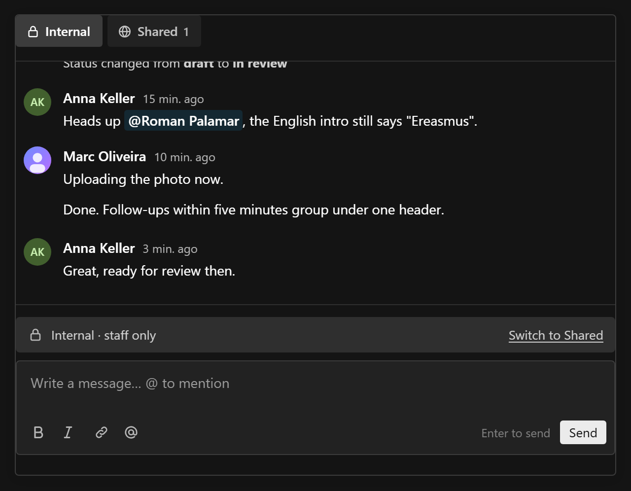
ChatPanel | Channel tabs, feed and composer of one conversation; a thread opens as a drawer on top | useChatPanel |
ChatChannelTabs | One tab per readable channel, with unread counts | |
ChatFeed | The scrolling window over a feed or a thread | useFeed |
ChatMessage | One message: avatar, name, time, body, thread summary, menu, inline edit | useMessage |
ChatThread | A root, its replies as their own feed, and a reply composer | useThread |
ChatComposer | The message editor under a channel cue, with Send | useComposer |
MessageMenu, useMessageMenu | A message's "⋯" menu, and access to it from slot components | |
Avatar | A picture, or initials on a colour derived from the user key | |
ChatRichTextProvider | Composer features and JSX converters for every component below it | |
ChatComponentsOverride | Replaces built-ins for everything below it |
Every Chat* component in the first eight rows can be replaced, from the config or in code, and a replacement can render the built-in to wrap it. See Replacing components.
ChatTrigger

The button comments() puts into the document controls. It takes the key from the document being edited (collection:<slug>:<id> or global:<slug>), or from conversationKey.
| Prop | Type | |
|---|---|---|
instance | string | Required |
conversationKey | string | Overrides the key taken from the document |
It renders nothing on a create view (no id yet) and nothing when the user can read no channel of the target. The label reads "Comment" at zero and "Comments" with a count otherwise. The unread dot shows only with reads on. The drawer's modal slug is derived from the instance and key, so two triggers for one conversation open the same drawer.
ChatDrawer
| Prop | Type | |
|---|---|---|
conversationKey | string | Required |
instance | string | Required |
drawerSlug | string | The Payload modal slug it opens under. Required |
title | ReactNode | Default: "Comments" |
subtitle | ReactNode | A line under the title; ChatTrigger passes the document's title |
header | ReactNode | Extra content after the title, before the drawerHeader slot |
components | Partial<ReplaceableComponents> | Replacements for everything the drawer draws. See Replacing components |
renderType | (message) => ReactNode | Draws messages whose type is not text |
Open it with Payload's useModal().openModal(drawerSlug). A thread opens under `${drawerSlug}-thread`, stacked on top.
ChatPanel
The drawer's body without the drawer: channel tabs, the current channel's feed, the composer, and the thread drawer. It fills its parent's column, so it also works inline in a form (see Custom views).
| Prop | Type | |
|---|---|---|
conversationKey | string | Required |
instance | string | Required |
threadSlug | string | The Payload modal slug a thread opens under. Required |
renderHeader | (panel: UseChatPanelResult) => ReactNode | Drawn first, with the panel's state |
components | Partial<ReplaceableComponents> | Replacements for everything the panel draws |
renderType | (message) => ReactNode |
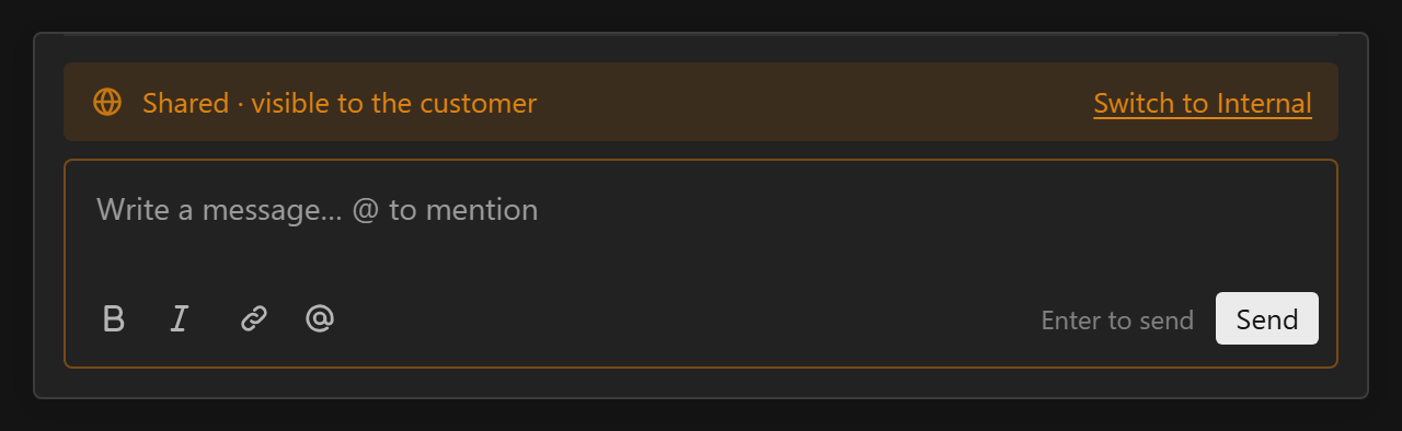
With exactly two channels, the composer's cue line carries a "Switch to <other>" link. A read-only channel shows the reason in place of the editor.
ChatChannelTabs
| Prop | Type | |
|---|---|---|
channels | ChannelView[] | From useChannels or useChatPanel |
active | string | The current channel's slug |
onChange | (slug: string) => void | |
reads | boolean | Default true; false hides the counts |
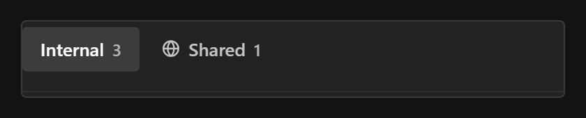
Payload's own tab buttons. A channel with a cue gets an icon: a lock for neutral, a globe for warning. Counts cap at "99+". With one channel it renders nothing.
ChatFeed
| Prop | Type | |
|---|---|---|
conversation | UseConversationResult | From useConversation, useThread or useChatPanel().conversation |
instance | string | Required |
empty | ReactNode | Shown when the channel has no messages |
items | FeedItem[] | Rows from elsewhere ({ at, id, node }), interleaved by timestamp |
onOpenThread | (message) => void | Shows thread summaries and "Reply in thread"; omit inside a thread |
readOnly | boolean | No Edit or Delete on any message |
renderType | (message) => ReactNode |
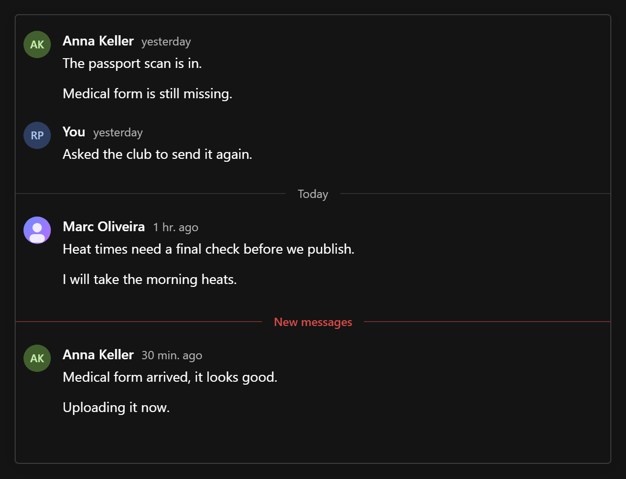
It opens at the "New messages" divider when there is unread, else at the bottom. It keeps its place while older pages load above, groups consecutive messages by one author into compact rows, puts a separator between days, and loads the next page when you scroll to the edge of the window. New messages below the fold show a "N new" pill; while the window is not at the latest page, the pill reads "Jump to latest".
ChatMessage
| Prop | Type | |
|---|---|---|
message | WindowMessage | Required |
authors | AuthorsMap | Required |
instance | string | Required |
viewer | string | null | The viewer's user key |
compact | boolean | A follow-up from the same author: no avatar, no name line |
readOnly | boolean | No Edit or Delete, even on the viewer's own messages |
onOpenThread | (message) => void | Shows the thread summary and "Reply in thread" |
threadReadAt | string | When the viewer last read this message's thread, for "new" |
renderType | (message) => ReactNode | For non-text types, tried before the type's configured Component |
header | ReactNode | Replaces the name and time line |
footer | ReactNode | Under the body, before the messageFooter slot |
actions | ReactNode | Menu items after Reply, Edit and Delete |
A deleted message that still anchors a thread stays as a "Message deleted" placeholder, and its messageFooter slot still renders. A message being sent is dimmed and reads "Sending…". Edit opens ChatComposer in place; Delete asks through Payload's ConfirmationModal.
ChatThread
| Prop | Type | |
|---|---|---|
root | WindowMessage | Required |
channel | ChannelView | The root's channel, for canCreate |
authors | AuthorsMap | The authors the root's feed already knows |
instance | string | Required |
viewer | string | null | |
renderType | (message) => ReactNode |
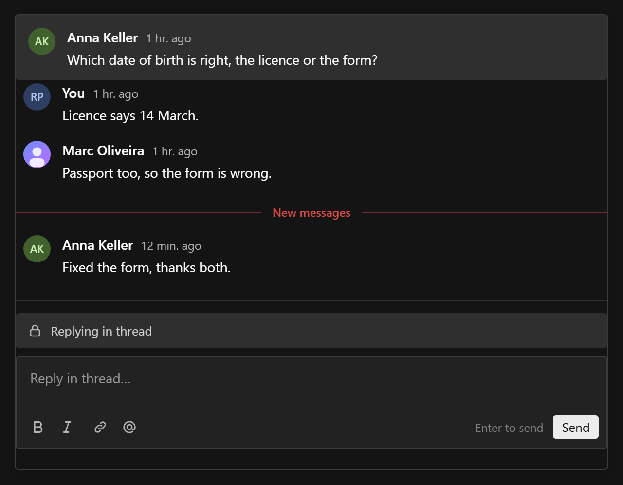
The replies are their own window (parent set), so they page and stay live independently of the main feed. The reply composer carries a "Replying in thread" cue.
ChatComposer
| Prop | Type | |
|---|---|---|
conversationKey | string | Required |
channel | string | Required. A reply takes its root's channel on the server anyway |
instance | string | Required |
parent | string | null | The root id, to reply in a thread |
cue | { label, tone } | null | The line above the editor |
cueAction | { label, onClick } | null | A link at the end of the cue line |
disabledReason | ReactNode | Replaces the editor, e.g. for a read-only channel |
placeholder | string | |
submitLabel | string | Default "Send", or "Save" when editing |
submitOn | 'enter' | 'mod+enter' | Default enter |
toolbar | 'bottom' | 'top' | 'none' | { placement, items } | See Styling |
features | ({ defaultFeatures }) => ComposerFeature[] | See Rich text |
above | ReactNode | Under the cue, before the composerAbove slot |
actions | ReactNode | Buttons next to Send, after the composerActions slot |
autoFocus | boolean | Default: only when editing |
initialBody, onSave, onCancel | Editing mode: the body goes to onSave instead of being sent |
Enter sends and Shift+Enter breaks the line. A failed send keeps the text and offers Retry under the same clientId, so a retry never posts twice. When an extension takes files (attachments()), the composer also accepts drops and pastes of files; its composerBelow and composerActions slots render inside it, where composer addons add to the send. The editor itself and its features are described in Rich text.
MessageMenu and useMessageMenu
MessageMenu is the "⋯" button beside a message, on Payload's Popup. From top to bottom: the messageQuickActions row, then Reply in thread, Edit and Delete, then the actions prop and the messageActions slot. It renders nothing when the viewer has nothing to do with the message. The menu sits in its own column beside the message, so it never covers the text; it shows on hover or focus, and always on touch screens.
| Prop | Type | |
|---|---|---|
message | WindowMessage | |
instance | string | |
own | boolean | Offers Edit (text messages) and Delete |
onEdit, onDelete | () => void | |
onOpenThread | (message) => void | Offers Reply in thread |
actions | ReactNode | Extra items |
Inside the menu, useMessageMenu() returns { message, close }, so a slot component can close the menu after acting. Outside a menu it returns null.
Avatar
| Prop | Type | |
|---|---|---|
userKey | string | Required; seeds the colour |
author | { name, avatar?, deleted? } | From the authors map |
size | number | Default 28 |
className | string | Replaces conversations-avatar; --conversations-avatar-hue stays set |
A picture when the author has one, else up to two initials on a hue that stays the same for one person across the admin. A deleted user gets an empty grey circle.
ChatRichTextProvider
composerFeatures and converters for every ChatComposer and message body below it, so a message looks the way it was written. A composer's own features prop wins. See Rich text.
Behaviour worth knowing
- Threads stack. A thread opens as a second Payload drawer over the conversation drawer, and closing it returns to the feed where you were.
- Drafts survive closing. An unsent draft is kept per conversation, channel and thread for the life of the page, so closing and reopening a drawer brings it back.
- No loading flicker. A feed you opened before is served from a window cache at once and refreshed in the background. A thread shows its root immediately.
- Unread. Opening a feed with unread messages places a "New messages" divider before the first one. The read cursor moves only when the end of the feed is actually on screen, not when the drawer opens.
- Read-only channels. When the viewer can read a channel but not write to it (a closed ticket, an archived room), the composer shows the reason and no message offers Edit or Delete, including the viewer's own. See Access.
The API behind all of this, for your own markup, is in Headless.