Replacing components
Swap any built-in admin component for your own, from the config or in code, and wrap the default where that is enough.
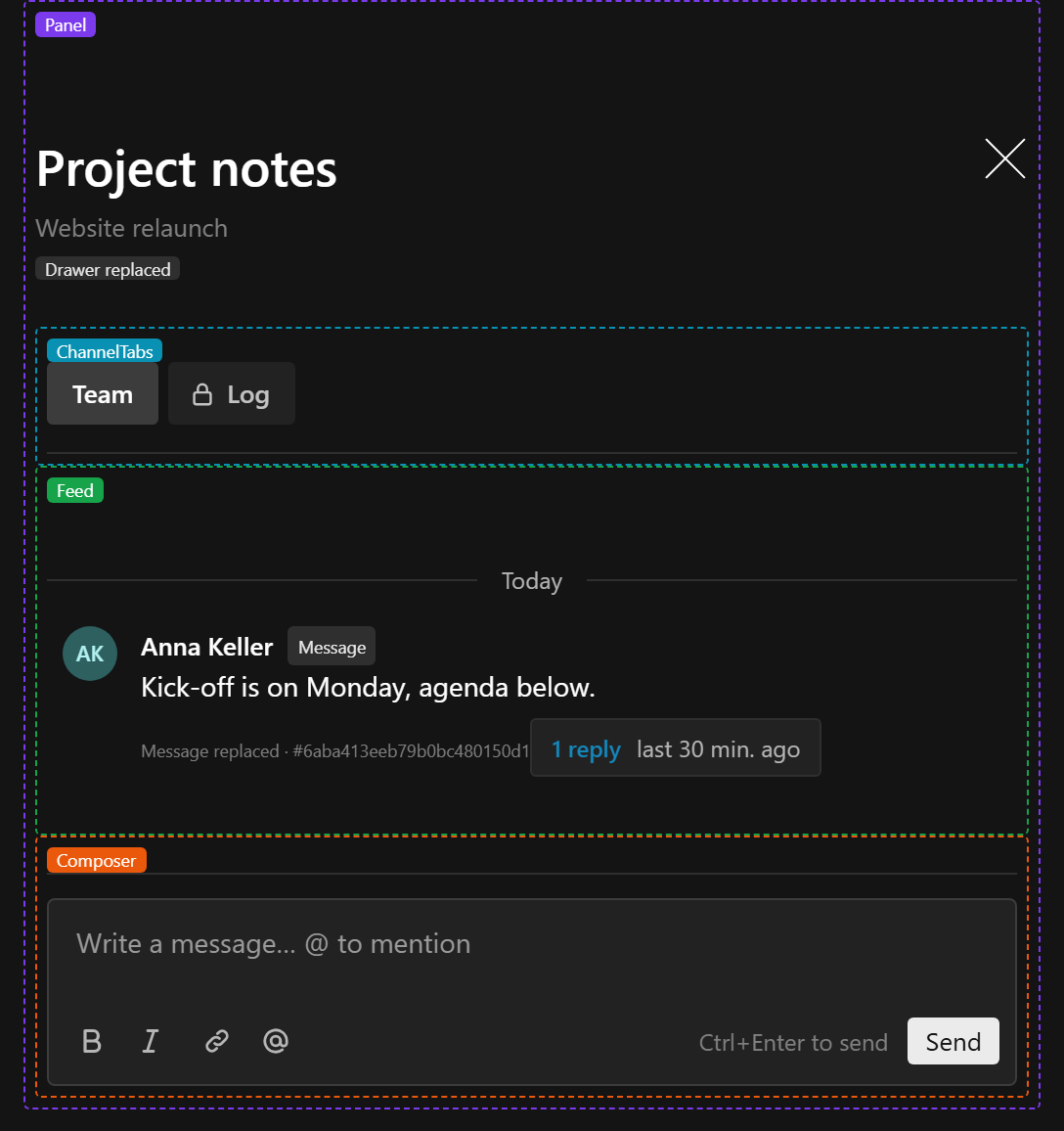
Slots add to the built-in components. When adding is not enough, replace a component outright. Every built-in the admin draws can be replaced, and a replacement reaches every place that component appears, the comments() drawer included:
| Name | Replaces | Drawn |
|---|---|---|
Trigger | ChatTrigger | The button comments() puts in the document controls |
Drawer | ChatDrawer | The drawer the trigger opens |
Panel | ChatPanel | Inside the drawer, and wherever you render ChatPanel: tabs, feed, composer, thread drawer |
ChannelTabs | ChatChannelTabs | Above the feed |
Feed | ChatFeed | The channel feed and a thread's replies |
Message | ChatMessage | Every message, thread roots included |
Composer | ChatComposer | Sending, replying in a thread, and editing a message |
Thread | ChatThread | Inside the thread drawer |
The layers stay the same whatever you replace: the headless hooks hold the behaviour, the built-ins draw it, ChatPanel and ChatDrawer assemble the built-ins, and comments() mounts the result. Replace one part and the rest keeps working around it; replace Panel or Drawer and the whole surface is yours.
From the config
conversations({
  slug: 'comments',
  // ...
  components: {
    Message: '/components/CommentMessage#CommentMessage',
    Composer: '/components/CommentComposer#CommentComposer',
  },
})
Each value is a Payload component path, registered in admin.dependencies, so run payload generate:importmap after setting it. Replacements must be client components ('use client'). A server component is skipped with a warning in the log and the default is used: these components render often and hold state, so a server round trip per render does not fit.
A replacement receives the props of the built-in it replaces (ChatMessageProps, ChatComposerProps, ChatPanelProps and so on, all exported from @10x-media/conversations/client).
In code
ChatPanel and ChatDrawer take a components prop with React components instead of paths. It applies to everything they draw and wins over the config:
import { ChatMessage, ChatPanel } from '@10x-media/conversations/client'

<ChatPanel
  conversationKey={key}
  instance="tickets"
  threadSlug={`ticket-${id}-thread`}
  components={{
    Message: (props) =>
      props.message.authorKey.startsWith('customers:') ? (
        <ChatMessage {...props} header={<CustomerHeader {...props} />} />
      ) : (
        <ChatMessage {...props} />
      ),
  }}
/>
For any other subtree, wrap it in ChatComponentsOverride from /client. Overrides nest, and the nearest one wins:
import { ChatComponentsOverride } from '@10x-media/conversations/client'

<ChatComponentsOverride components={{ Composer: CompactComposer }}>
  <TicketSidebar />
</ChatComponentsOverride>
The order is: the nearest ChatComponentsOverride (or components prop), then the instance's components option, then the built-in.
Wrapping the default
A replacement can render the built-in it replaces. Inside its own replacement a built-in always draws the default, so this does not loop, and it is the easiest way to change a part while keeping its behaviour:
'use client'
import { ChatComposer, type ChatComposerProps } from '@10x-media/conversations/client'

export const CommentComposer = (props: ChatComposerProps) => (
  <div className="comment-composer">
    <ChatComposer {...props} submitOn="mod+enter" toolbar="top" />
    <p className="comment-composer__hint">Comments are visible to your whole team.</p>
  </div>
)
Only the same name draws its default inside a replacement. A Panel replacement that renders ChatPanel still gets your Composer and Message replacements inside it.
The message
Filling its prop slots
The easiest replacement renders ChatMessage itself and fills its prop slots. Everything else (editing, deleting, the menu, thread summaries, placeholders) keeps working.
'use client'
import { ChatMessage, type ChatMessageProps } from '@10x-media/conversations/client'

export const CommentMessage = (props: ChatMessageProps) => {
  const { message } = props
  return (
    <ChatMessage
      {...props}
      footer={message.mentions?.length ? <small>{message.mentions.length} mentioned</small> : null}
      header={props.compact ? undefined : <MessageHeader {...props} />}
    />
  )
}
header replaces the name and time line. footer goes under the body, before the messageFooter slot. actions adds menu items before the messageActions slot. Rendering ChatMessage inside the replacement draws the default, so it does not loop.
Drawing your own
For a message that looks nothing like the default, build it from the headless pieces:
useMessage({ message, readOnly, threadReadAt, viewer })from@10x-media/conversations/react:own,deleted,canEdit,canDelete(already read-only aware),editingandsetEditing,save,remove,repliesandhasNewReplies.MessageBodyfrom/react: the body through Lexical's JSX converters, with mentions named fromauthors. PassuseChatRichText().convertersso a project's own rich text renders.MessageMenuandAvatarfrom/client, if you want the admin's menu and avatars.ChatComposerwithinitialBody,onSaveandonCancelfor inline editing.useTypeRenderer(instance)from/clientfor non-textmessages.
'use client'
import {
  ChatComposer,
  type ChatMessageProps,
  MessageMenu,
  useChatRichText,
  useTypeRenderer,
} from '@10x-media/conversations/client'
import { absoluteTime, MessageBody, useMessage } from '@10x-media/conversations/react'
import { ConfirmationModal, useModal, useTranslation } from '@payloadcms/ui'

export const LogMessage = ({
  authors,
  instance,
  message,
  onOpenThread,
  readOnly,
  renderType,
  threadReadAt,
  viewer,
}: ChatMessageProps) => {
  const state = useMessage({ message, readOnly, threadReadAt, viewer })
  const { converters } = useChatRichText()
  const renderConfiguredType = useTypeRenderer(instance)
  const { openModal } = useModal()
  const { i18n } = useTranslation()
  const confirmSlug = `log-delete-${String(message.id)}`

  return (
    <div className="log-message" data-message-id={String(message.id)}>
      <time dateTime={message.createdAt}>{absoluteTime(message.createdAt, i18n.language)}</time>
      <strong>{authors[message.authorKey]?.name}</strong>
      {state.deleted ? (
        <em>deleted</em>
      ) : state.editing ? (
        <ChatComposer
          channel={message.channel}
          conversationKey={message.key}
          initialBody={message.body}
          instance={instance}
          onCancel={() => state.setEditing(false)}
          onSave={state.save}
          parent={message.parent ?? null}
        />
      ) : message.type === 'text' ? (
        <MessageBody authors={authors} converters={converters} message={message} />
      ) : (
        (renderType?.(message) ?? renderConfiguredType(message))
      )}
      {state.replies > 0 && onOpenThread ? (
        <button onClick={() => onOpenThread(message)} type="button">
          {state.replies} replies{state.hasNewReplies ? ', new' : ''}
        </button>
      ) : null}
      {state.deleted || state.editing || message.sendStatus ? null : (
        <MessageMenu
          instance={instance}
          message={message}
          onDelete={() => openModal(confirmSlug)}
          onEdit={() => state.setEditing(true)}
          onOpenThread={onOpenThread}
          own={state.canDelete}
        />
      )}
      {state.canDelete ? (
        <ConfirmationModal
          body="The message is removed for everyone."
          heading="Delete message"
          modalSlug={confirmSlug}
          onConfirm={state.remove}
        />
      ) : null}
    </div>
  )
}
MessageMenu also renders the messageQuickActions and messageActions slots, so extension items such as reactions stay available. Render the messageFooter slot yourself with <ChatSlot name="messageFooter" ... /> from /client if extensions put things there.
What a replacement has to handle
- Compact rows. Consecutive messages by one author within five minutes arrive with
compact: true. Drop the avatar and name there, or the grouping looks broken. - Deleted messages. A deleted message has
deletedAtset and its content wiped on the server. It still arrives while it anchors a thread (or always, withdeleted: 'placeholder'), and it may still carry extension data such as reactions. - Sending state. An optimistic message has
sendStatus: 'sending'and a temporarylocal:<clientId>id until the server confirms it, andsendStatus: 'failed'if the send failed (the composer offers Retry). Offer no menu whilesendStatusis set. - Read-only channels. Pass
readOnlytouseMessage;canEditandcanDeletethen stay false. - Threads.
onOpenThreadis absent inside a thread and on its root. Show the thread summary only when it is set.threadReadAtdecides whether replies are new. - Custom types. A message whose
typeis nottexthas no body to render. UserenderType, thenuseTypeRenderer. - Anchors. Keep
data-message-idon the outer element if anything in your project scrolls to messages.
The drawer and the trigger
A Drawer replacement receives drawerSlug and must render Payload's Drawer under that slug itself, since that is the modal the trigger opens. Wrapping is usually simpler:
'use client'
import { ChatDrawer, type ChatDrawerProps } from '@10x-media/conversations/client'

export const CommentsDrawer = (props: ChatDrawerProps) => (
  <ChatDrawer {...props} header={<SlaBadge conversationKey={props.conversationKey} />} />
)
A Trigger replacement receives instance and, outside an edit view, conversationKey. Inside an edit view it works out the key itself (useDocumentInfo() with collectionKey or globalKey), renders nothing without one, and opens a drawer. useChannels(key) gives the count and unread state the default button shows, and renders nothing when the viewer can read no channel.
On a website
The website components come from the shadcn registry and are copied into your project, so there is nothing to configure: edit conversation-message.tsx, conversation-composer.tsx and the rest directly, or build from the hooks in Headless.