Slots
Add your own components to the drawer, the composer and every message, from the config or through props.
A slot adds to the built-in UI without replacing it. There are two kinds:
- Config-level slots, set in the instance's
slotsoption as Payload component paths. They apply everywhere the instance is drawn in the admin, including the drawercomments()mounts. - Prop slots on the components themselves, for UI you compose in code.
To replace a component outright rather than add to it, see Replacing components.
Config-level slots
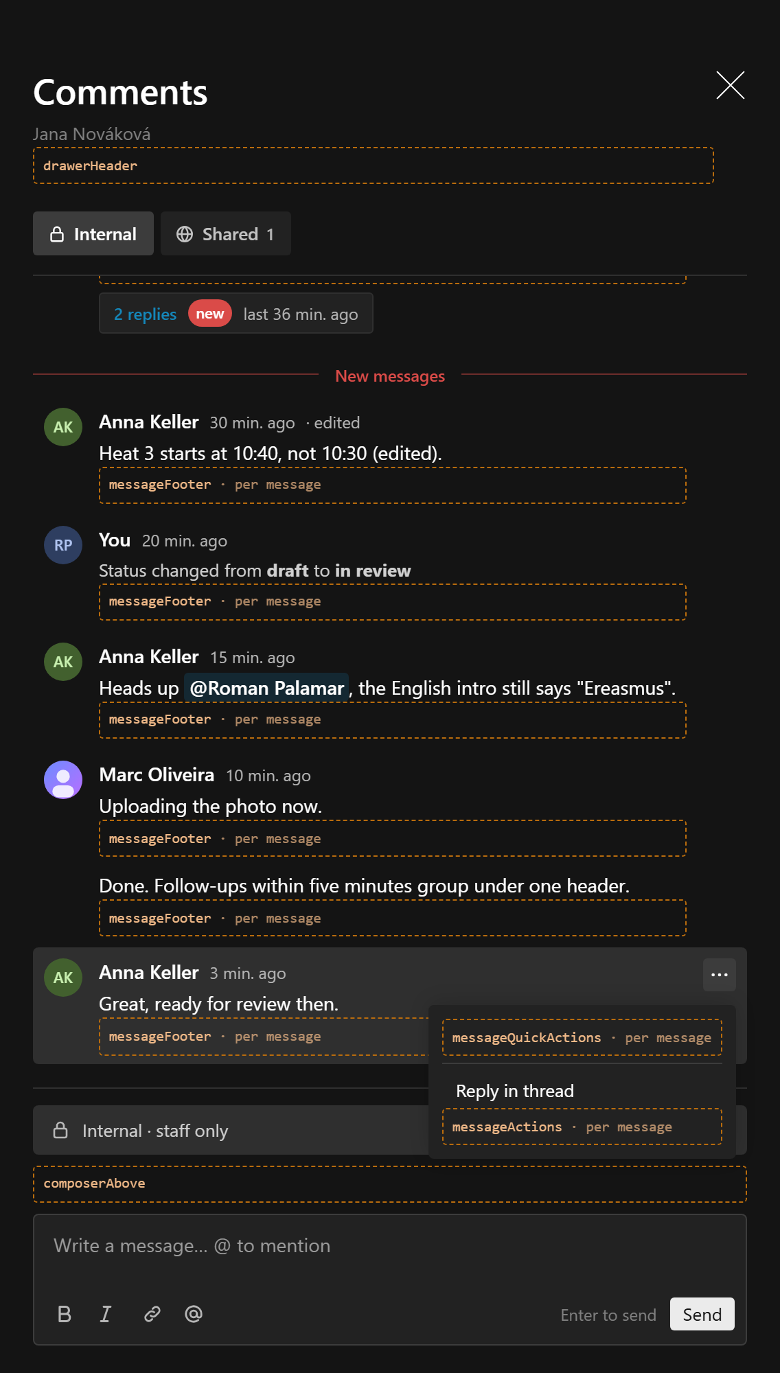
conversations({
  slug: 'comments',
  // ...
  slots: {
    drawerHeader: '/components/ConversationLinks#ConversationLinks',
    messageActions: ['/components/CopyLink#CopyLink', '/components/Flag#Flag'],
    messageFooter: '/components/SeenBy#SeenBy',
  },
})| Slot | Where | Gets message |
|---|---|---|
drawerHeader | In the drawer header, after the title and subtitle | no (gets the current channel) |
composerAbove | Above the editor, under the channel cue. Not while editing a message | no (gets channel) |
composerBelow | Inside the composer's box, between the text and the bottom row, e.g. picked files. Not while editing | no (gets channel) |
composerActions | Next to Send, before the composer's actions, e.g. an attach button. Not while editing | no (gets channel) |
messageQuickActions | A row at the top of each message's "⋯" menu, for one-click actions | yes |
messageActions | Items in each message's menu, after Reply in thread, Edit and Delete | yes |
messageFooter | Under each message body, deleted placeholders included | yes |
Each slot takes one component or an array, rendered in order. The host's components come first, then each extension's in the order of extensions (this is how reactions adds its bar and quick row, and attachments its button, picked files and file list). Paths are registered in admin.dependencies, so payload generate:importmap finds them.
messageFooter renders on a deleted placeholder too, because what hangs off a message (reactions, for one) can outlive its text. Check message.deletedAt when your component should not.
The composer slots render inside the composer, so a client component there can add to the send with useComposerAddon (see Adding to the composer).
Client components
A client component renders directly, with ChatSlotProps:
type ChatSlotProps = {
  instance: string
  conversationKey: string
  channel?: string
  message?: ConversationMessage
}'use client'
import { type ChatSlotProps, useMessageMenu } from '@10x-media/conversations/client'
import { PopupList } from '@payloadcms/ui'
export const CopyLink = ({ conversationKey, message }: ChatSlotProps) => {
const menu = useMessageMenu()
if (!message) return null
return (
<PopupList.Button
onClick={() => {
void navigator.clipboard.writeText(`${location.href}#message-${message.id}`)
menu?.close()
}}
>
Copy link
</PopupList.Button>
)
}Menu slots render inside Payload's PopupList.ButtonGroup, so PopupList.Button looks native there. useMessageMenu() returns { message, close } inside the menu and null elsewhere; call close() once the action is done.
Slot components sit under the instance's provider, so every hook from @10x-media/conversations/react works in them (useChannels, useExtension, useExtensionApi and the rest).
Server components
A server component is rendered after mount through a server function, with a real request (see How server components reach the admin):
type ChatServerSlotProps = ChatSlotProps & { req: PayloadRequest; locale; permissions }import type { ChatServerSlotProps } from '@10x-media/conversations/rsc'
export const SeenBy = async ({ message, req }: ChatServerSlotProps) => {
if (!message || message.deletedAt) return null
const { totalDocs } = await req.payload.count({ collection: 'receipts', where: { message: { equals: message.id } } })
return totalDocs > 0 ? <small>Seen by {totalDocs}</small> : null
}Before rendering, the dispatcher runs the instance's access for the conversation and checks the message's channel against it, so a crafted request shows nothing the user could not read through the endpoints.
One request per slot and message. A server messageFooter in a feed of 30 messages makes 30 server function calls. Results are cached per message and updatedAt for the life of the page, so an edit renders afresh and a re-render does not. Prefer client components for the per-message slots, and fetch what you need in one request there.
Server slots exist only in the admin.
How server components reach the admin
Rendering a server component after mount takes a Next server action, and Payload funnels all of its own through one action declared in your generated app/(payload)/layout.tsx, with no config-level way to add a name to it. So the plugin offers two routes, per instance, with serverComponents.
serverComponents: 'widget', the default
Nothing is asked of you. The plugin registers one internal dashboard widget, Conversations (internal), and renders through Payload's built-in render-widget.
That widget appears in the dashboard's "Add widget" drawer, which readers see only while editing their dashboard. One widget serves every instance, and it is registered only when some instance on this route has a slot or message type component of yours: whether a component is a server one shows only in the import map, so every path you configure counts, while the plugin's own (the reactions and attachments slots) never do. Added to a dashboard by hand, it shows a notice that it is not for display and can be removed.
serverComponents: 'server-function'
No widget is registered for the instance. In exchange you wire the plugin's own function yourself:
import config from '@payload-config'
import { conversationsServerFunctions } from '@10x-media/conversations/rsc'
import { handleServerFunctions, RootLayout } from '@payloadcms/next/layouts'
import type { ServerFunctionClient } from 'payload'

import { importMap } from './admin/importMap.js'

const serverFunction: ServerFunctionClient = async (args) => {
  'use server'
  return handleServerFunctions({
    ...args,
    config,
    importMap,
    serverFunctions: conversationsServerFunctions,
  })
}conversations({ slug: 'comments', serverComponents: 'server-function', /* ... */ })With another plugin that registers functions the same way, spread both: serverFunctions: { ...conversationsServerFunctions, ...settingsOverlayServerFunctions }.
Payload generates that layout file and marks it "DO NOT MODIFY", so this one is opt in. Forget the wiring and the browser console says so in as many words, naming both the fix and the way back.
Choosing
Take the default unless a stray row in the dashboard's widget drawer bothers you more than an edit to a generated file. If no instance has a slot or message type component of yours, neither is used: nothing is registered and nothing is called.
Custom message type components
A custom message type with a Component is drawn in the same way as a slot: a client component renders directly with ChatSlotProps (message and the view's authors set), a server component goes through the server function with ChatServerSlotProps. A message of a type with no component shows "This message cannot be shown here".
With layout: 'bare' the component is the whole row rather than the body under the author's name; see Layout.
useTypeRenderer(instance) returns the function the admin uses, (message, authors?) => ReactNode | null, for your own markup. In a composed view you can also pass renderType to ChatPanel, ChatDrawer, ChatFeed, ChatThread or ChatMessage; it is tried first, and the configured component is the fallback when it returns null or undefined.
Prop slots
When you compose the components yourself, pass React nodes instead:
| Component | Prop | |
|---|---|---|
ChatDrawer | header | After the title, before the drawerHeader slot |
ChatDrawer, ChatPanel, ChatFeed, ChatThread, ChatMessage | renderType | Non-text messages |
ChatPanel | renderHeader | Drawn first, with the panel's state |
ChatFeed | empty | Shown for an empty channel |
ChatFeed | items | Rows of your own ({ at, id, node }), interleaved by timestamp, e.g. status changes kept elsewhere |
ChatMessage | header | Replaces the name and time line |
ChatMessage | footer | Under the body, before messageFooter |
ChatMessage | actions | Menu items, before messageActions |
ChatComposer | above | Under the cue, before composerAbove |
ChatComposer | actions | Buttons next to Send, after composerActions |
<ChatFeed
  conversation={conversation}
  instance="tickets"
  empty="No replies yet."
  items={statusChanges.map((change) => ({
    at: change.createdAt,
    id: `status-${change.id}`,
    node: <StatusRow change={change} />,
  }))}
/>ChatMessage's prop slots are what a replacement message uses to wrap the default.
Slots from an extension
An extension contributes slots through its own slots field, appended after the host's. See Writing your own.